Follow that tank! Political orientation of UK think tanks (and newspapers), via Twitter ★
Updated: I’ve updated the charts and figures to reflect a couple of changes. Firstly, a small number (<10) of MPs were attributed to the wrong party, due to an error in scraping from Tweetminster—that’s now fixed. Secondly, I was inadvertently excluding any think tank followed only by one party—they’re now back in. The results change very little.
On Friday last week, the Centre for Policy Studies released a report claiming the BBC is biased to the left.
@CPSThinkTank Published yesterday: ‘Bias at the BEEB? A quantitative study of slant in #BBC Online reporting’ http://t.co/L7UTOvvKUW #journalism
It uses a quantitative methodology to address something most people think of as a qualitative issue: media bias (or ‘slant’).
This type of study—and the general methodology the CPS adopted—has a fairly strong pedigree. The idea is this: measure the political bias of a media outlet by counting relative mentions of leftish think tanks and rightish think tanks. If there are more of the former, it is left biased; if more of the latter, right biased.
But, you may wonder, how do we objectively assess which think tanks are leftish and which are rightish?
The standard solution has been to examine Hansard (Congressional transcripts in the US), and count how many times the think tank is cited by politicians. If it is cited more by politicians of the left, call it left oriented; if it is cited more by politicians of the right, right oriented. You see how this works?
The genius of this system, of course, is that in (more or less) two-party polities like the US, UK and Australia, most politicians can be unambiguously sorted into left and right (assuming you accept those labels). So although our measure of bias is several steps removed, we are at least building on a solid foundation. Politician-party affiliation serves as our North Star and… er… Southern Cross.
The problem with the CPS report is that it diverges from this accepted, peer-reviewed methodology at a key point: instead of using citations by politicians to rank think tanks, it uses citations by the Guardian (in the red corner) and the Telegraph (in the blue corner).
This may already strike you as strange and somewhat contradictory: we have to assume that the Guardian and Telegraph are fixed at the endpoints of the political spectrum, in order to identify where on that spectrum the BBC lies. In effect, we are assuming the kind of knowledge (about the Guardian and Telegraph) that we are trying to find out (about the BBC).
The practical problem with this is that the Guardian and the Telegraph differ on more than just the political dimension, as Chris Cook of the FT points out. So the measure of bias we are deriving is noisy, contaminated by other ways in which the Guardian and Telegraph differ.
The end result is that many people more familiar with UK think thanks than I find the CPS ranking of think tanks to be particularly kooky—’a very bizarre ranking’, as Cook puts it.
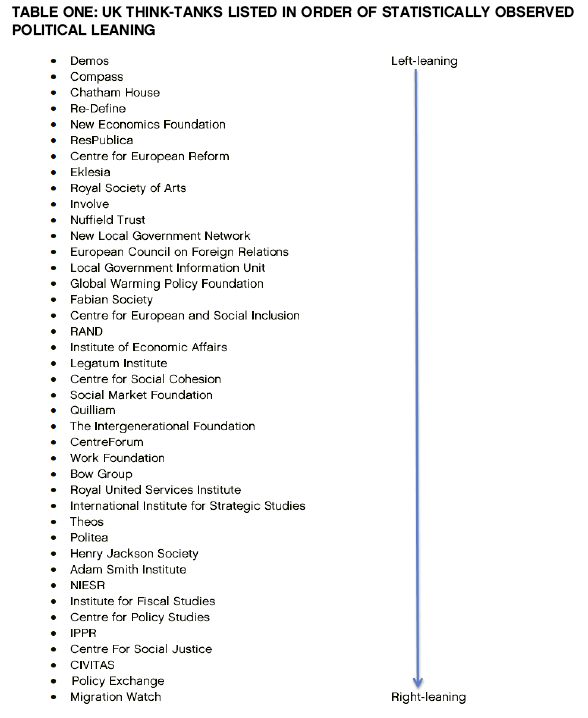
Chris Hanretty produced an alternative ranking using the traditional measure—parliamentary mentions—and sure enough it looks quite different (the IFS, for one, crosses the floor from right to left).
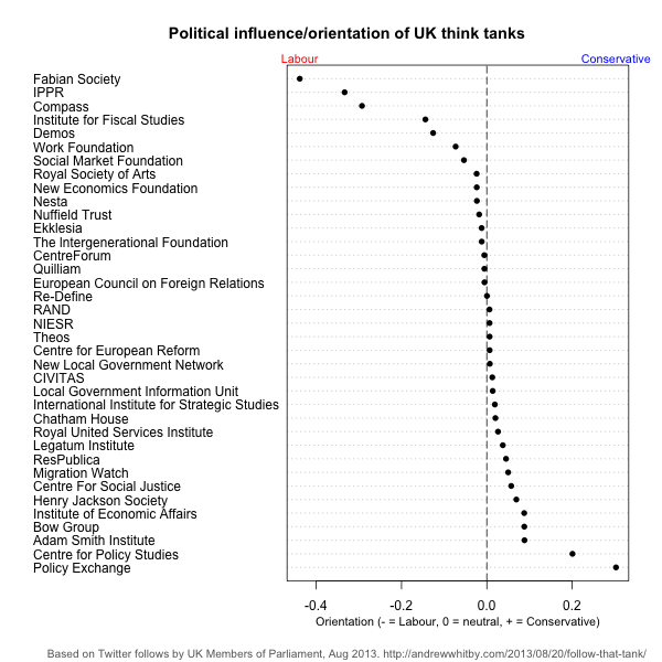
As it happens, I’ve recently been trialling Twitter data to assess political orientation. This relies on the property of homophily, which is the ‘tendency of individuals to associate and bond with similar others’. In Twitter terms, it means that you are likely to have similar views to those people that you follow or are followed by (or retweet or are retweeted by). Of course this will not always be true—you may follow somebody you disagree with, because you enjoy hearing provocative viewpoints. But as a general rule, it works fairly well.
There are several ways to apply this idea. I chose the simplest, which is to count the proportion of MPs from each party (396 of 650 on Twitter, from Tweetminster) that follow each think tank (36 of 41 on Twitter). If you take the difference (Labor - Conservative), you get a neat measure of left orientation. To make things interesting, I also added the highest circulation UK newspapers, and an additional think tank, Nesta, where I work. It is an extremely simple method, but the results look fairly convincing nonetheless. The Spearman rank correlation with Hanretty’s scores is 0.65, p = 0.0006—note that my chart is flipped L-R compared with his, so you should negate my scores for the correlation. The rank correlation with the CPS list is actually negative (-0.40 and now significant with p = 0.02 but p = 0.11, so not significant)!
Similarly, for UK newspapers, the results are fairly convincing.
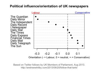
They appear to correlate fairly well with other similar measures, such as this one from the Guardian.
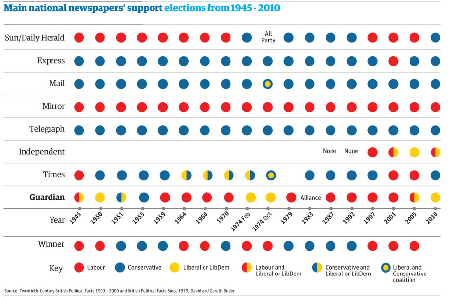 Party support in general elections. Source: The Guardian.
There are, of course, more sophisticated ways of using Twitter. Politicians probably don’t use Twitter the way the rest of us do (they are likely more careful about who they follow). Furthermore, my impression of Twitter semantics is that following is not as strong an endorsement as retweeting. Accounting for both of these, my preferred method would be to find all the users who have retweeted a given think tank’s tweets, then assess the politics of those users by looking at which MPs they follow, and apply that back to the think tanks themselves.
But I leave that as an exercise for the reader.
Disclosure: I work at Nesta. (I don’t, however, vote in UK elections.)
Data via Google Spreadsheet.
Add comment
Comments are moderated and will not appear immediately.
Comments (8)
Any chance of a table/spreadsheet? I want to make a point with this chart and this website. Was going to use a chart digitizer but 95%+ CPU at idle until the crash is boring.
Sure, I’ll put a simple summary spreadsheet up in a few hours, and ideally the full data/code somewhere like github this weekend.
Never mind, just managed to digitize it. The correlation between your Labour/Conservative scoring and WhoFundsThem transparency (coded with A=1 etc) is 0.72:-)
Chart: https://twitter.com/yorksranter/status/370185557327896576/photo/1
You said you’d do the BBC, and then you didn’t. As an old, highly political news consumer, i’d say it practiced 1) not siding at all and 2) repeating the government of the day as the objective truth, both at the same time.
I could include with the newspapers, but my suspicion is that it wouldn’t be very revealing (likely nearly everybody follows the BBC). I also didn’t want to confuse this with the CPS’s claim of BBC bias, because the two are very different measures.
Reblogged this on The Irish Politics Forum.
The Twitter graph would suggest that most think-tanks (from the IFS to the ASI) are broadly neutral - only a few outliers are significantly away from the baseline.