UK ethnicity dot map ★
The 2011 census ethnicity map is no longer live. The ONS has produced a similar dot map fro the 2021 census that you can visit here. I’m keeping this post up for historical purposes only now.
Frequently asked questions #
What am I looking at?
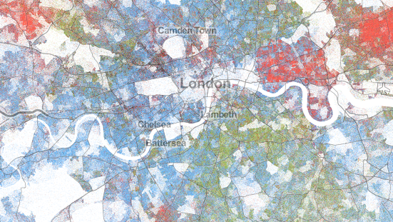
Every person counted in the 2011 census of England, Wales and Northern Ireland is represented as a dot on this map - all 57,886,775 of them. Each dot’s location is near to a person’s usual residence, but the locations are not exact; public census results only report location to within a small area, usually containing a few hundred people. These are called ‘output areas’ in England and Wales, and ‘small areas’ in Northern Ireland. To create the map, I randomly place each person within their respective area. The colour of the dot reflects the person’s ethnicity as reported on the census.
Can I use this map?
Yes, with attribution. Consider it CC BY 3.0 licensed. The data is from the 2011 Census, via ONS (England & Wales) and NISRA (Northern Ireland) and you should cite them too, as the original source of the data.
What happened to Scotland?
The UK actually has three coordinated censuses, devolved in Scotland (to NRS, National Records of Scotland) and in Northern Ireland (to NISRA, the Northern Ireland Statistics & Research Agency). As of September 2013, NRS has not yet released ethnicity data from the census.
Why are there people living in Hyde Park, at Heathrow Airport, etc
The census data only show that a person lives in particular statistical area, not exactly where they live. Some statistical areas include within their boundaries parks, lakes, airports, etc. Since I randomly locate each dot, it may well end up on one of these features. Hopefully in the next version I will use additional data on these locations to tidy up such anomalies.
Where are the place names for Leicester, Newcastle, etc?
Missing. I’m using third-party mapping tiles for the background, but they seem to have made some mysterious choices about which place names to include and exclude in the UK. If you know of a better set of tiles, please let me know.
Is this directly comparable with Dustin Cable’s US Racial Dot Map?
No, for at least two reasons. First, while I’ve tried to retain the look of Dustin’s map, I used a different module to draw points, which means the exact appearance varies from his map, particularly when zoomed out. Second, US race groups and UK ethnic groups are hard enough to define as it is (there’s a book on that), and probably aren’t directly comparable.
Okay, well what is ethnicity anyway? Why is it ethnicity in the UK and race in the US?
Ethnicity is complicated. It’s problematic. In censuses it is usually self-defined. It may be the same thing as race.
I don’t know why the UK asks ‘What is your ethnic group?’ while the US asks ‘What is Person 1’s race?’ If you’re a census historian, and know the answer to that question, I’d love to hear it. (Actually if you’re a census historian, then I’d love to meet you, full stop.)
Can you tell me more about ethnicity in the UK?
No. But these people probably can.
What data sources did you use?
For England and Wales ethnicity, I used KS201EW at the level of output areas, available from the ONS Nomis website. For England and Wales output area boundaries, I used ONS shapefiles (full, clipped).
For Northern Ireland ethnicity, I used KS201NI at the level of small areas, available from the NISRA NINIS website. NISRA doesn’t group ethnicities in quite the same way as ONS, so I created groups for White (White, Irish Traveller), Asian (Chinese, Indian, Pakistani, Bangladeshi, Other Asian) and Black (Black Caribbean, Black African, Black other). I believe this is consistent with the ONS data. For Northern Ireland small area boundaries, I used NISRA shapefiles.
This map is The Truth, right?
No, this map, like any map, is just one way of visualising a complex reality. I made all kinds of choices about how to arrange, color and display the dots, and these choices may well significantly affect your perception of the data presented. Caveat emptor!
If they cancel the census, will you be able to produce a map like this in 2021?
Highly questionable.
Can I use these images for my blog/article/t-shirt/coffee mug/etc?
Sure, as long as you credit me and link them back to projects.andrewwhitby.com/uk-ethnicity-map (except for the t-shirt and coffee mug - then just send me one in lieu of a link!)
Can I get a copy of your code?
Of course. It’s on github.
Who else deserves credit?
Dustin A. Cable produced the US map that inspired me, and provided the code on which I based my map. His work, in turn, was based on a project by Brandon Martin-Anderson from the MIT Media Lab. The reference tiles showing roads and placenames are from Stamen Design based on OpenStreetMap data.
Technical Details #
The code is based on Dustin’s (see his Methodology), although I substantially rewrote his code to make it more general and, hopefully, quite a bit more reuseable.
The key differences are that:
-
All the project-specific settings are in settings.py, so it’s easy to adapt to different datasets.
-
I added a processing stage to merge attributes (here, ethnicity) into the shapefiles, since these usually come separately.
-
I automatically translate boundaries, if necessary, to GDS-84, since the UK does not use this by default (unlike the US).
-
Instead of using Processing for the image output, I use Python with the PIL library. I had some trouble with command-line Processing, and it seemed unnecessary to add an extra language/interpreter when Python has perfectly good image libraries.
-
I have included a template client, and a script to automatically generate a ready-to-deploy index.html, including nice features like an HTML-based legend (rather than an image).
Since my website is hosted on wordpress.com, I have hosted the map on Amazon S3 cloud storage, which is a fairly straightforward process, for a server-static/entirely-client-side application like this.
Add comment
Comments are moderated and will not appear immediately.
Comments (8)
This is really interesting and thank you for doing it!
Could you make one little improvement though? It would be great to have ability to hide specific ethnic groups. Right now even on max zoom dots are so small that the colors get mixed together (if one ethnicity is a minority) and very hard to tell apart.
Thank you in advance!
I’m glad it’s useful.
It’s not straightforward for me make it work like you suggest, although I agree it would be an improvement. I’ll think about whether there’s an easier way to add that feature.
Hey your map appears to have stopped working. Loads the full map to begin with ok but when i attempt to zoom the map goes white, you think its just loading but the map never reappears. Has anyone else had this problem?
You’re right, thanks for letting me know. I’ll have a look into it…
Fixed now - seems like an odd bug in Chrome, which I’m now working around. Let me know if this doesn’t fix it for you.
This map is The Truth, right?
No, this map, like any map, is just one way of visualising a complex reality. I made all kinds of choices about how to arrange, color and display the dots, and these choices may well significantly affect your perception of the data presented.
One person’s idea of reality which can be interpreted by individuals differently - exactly what use was it meant to be?
I’m not sure that’s a useful way to approach it, Andrew’s statement about “The Truth” was somewhat rhetorical. Every map is a model. To paraphrase, there is no such thing as a good model, but some models are useful. Visualisation 101. In addition, the data itself is bucketed, as we’re dealing with output areas. Even if it was possible to record it down to the nearest square foot, how would anyone deal with, say, the ethnicity of a high rise block in 2D, where multiple ethnicities can be attributed to the same square foot of groud? What Mr Whitby has graciously and generously shared is a technique for creating a useful visual model using Python and the available data. As he stated, caveat emptor: How you interpret any maps you make is up to you and your reader.
Hi
Would you be able to supply a high resolution image of part of the map, so as I could print it?
Regards
Michael
Please provide a better link for that “cancel the census” article. The FT is now behind a paywall (in the UK, at least).
Regarding the Ethnicity Map, would you ever consider doing a further breakdown (South Asian vs East Asian)? I recognize that the work you have put into this map is amazing, just wondering if that might be a possibility. Granted I know the UK Census does not have much of a Breakdown in Asian Categories.