Growth slowdown (1): Robert Gordon's misleading chart
Income growth is not a neat story, but technology pessimists would like you to think it is. Robert Gordon provides the following neat picture of ‘Growth in real GDP-per-capita, 1300-2100’ (here or unpaywalled summary, here).
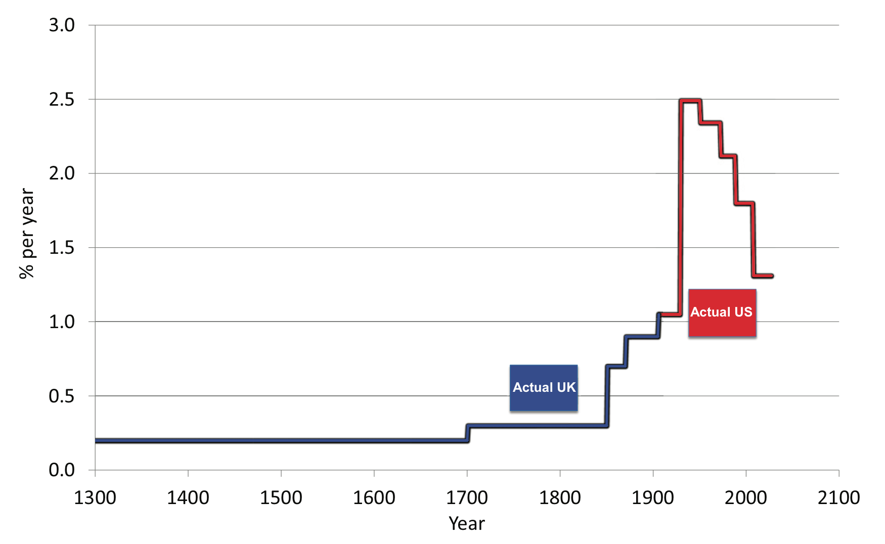
The end-date alone should be enough to make us realise that this is a stylised representation, at best (and the 2008 onwards data is purely imagined, a ‘provocative fantasy’ in Gordon’s words). But even with that caveat it is a highly selective and misleading representation of growth.
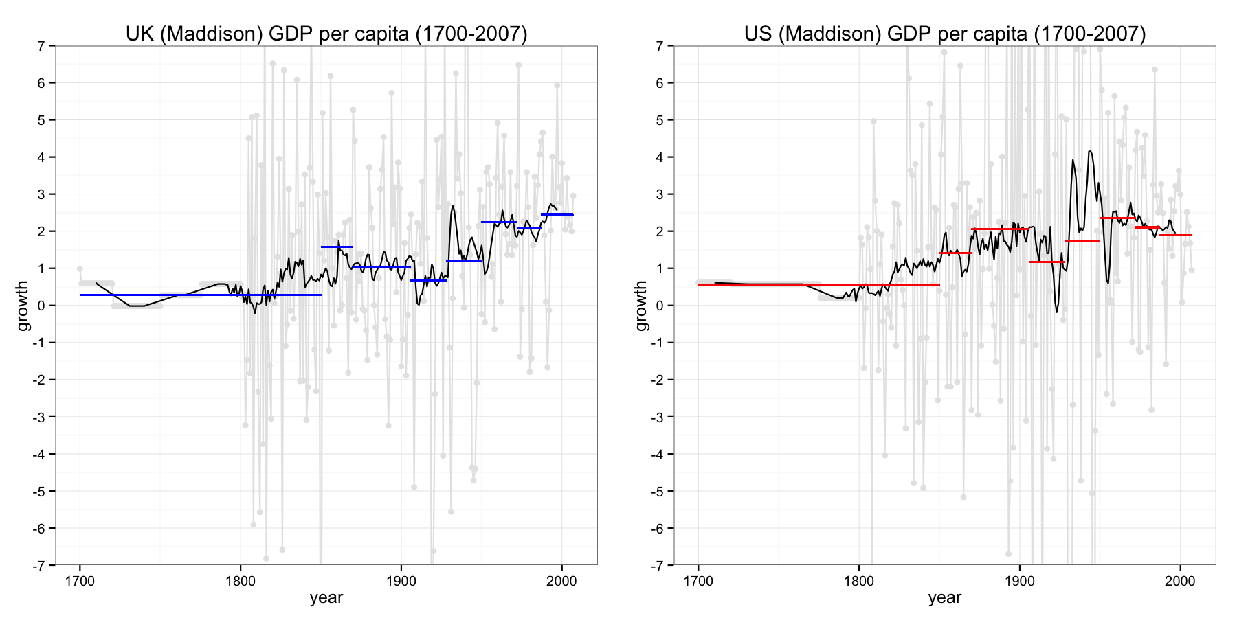
For starters, this is a strange chimera of US and UK GDP, with Gordon expecting us to take his word that the US took over from the UK as the frontier country in 1906. Lest you think that’s an unimportant decision, examine the charts below, using Maddison’s figures for either the UK or the US alone. Neither chart independently tells the same compelling story of smooth acceleration then deceleration in GDP per capita.
A second choice we should treat with suspicion is the different growth regimes Gordon chooses, with transitions in 1700, 1850, 1870, 1906, 1928, 1950, 1972, 1987 and 2007. These artificially suppress variation in income growth, making the story look much neater than it really is. The chart below is the closest I can get to Gordon’s chimera-GDP per capita, and shows (a) his regime-averages (blue/red), (b) the underlying annual data (grey) and (c) a 21 year moving average (around the length of Gordon’s regimes in the 20th century).
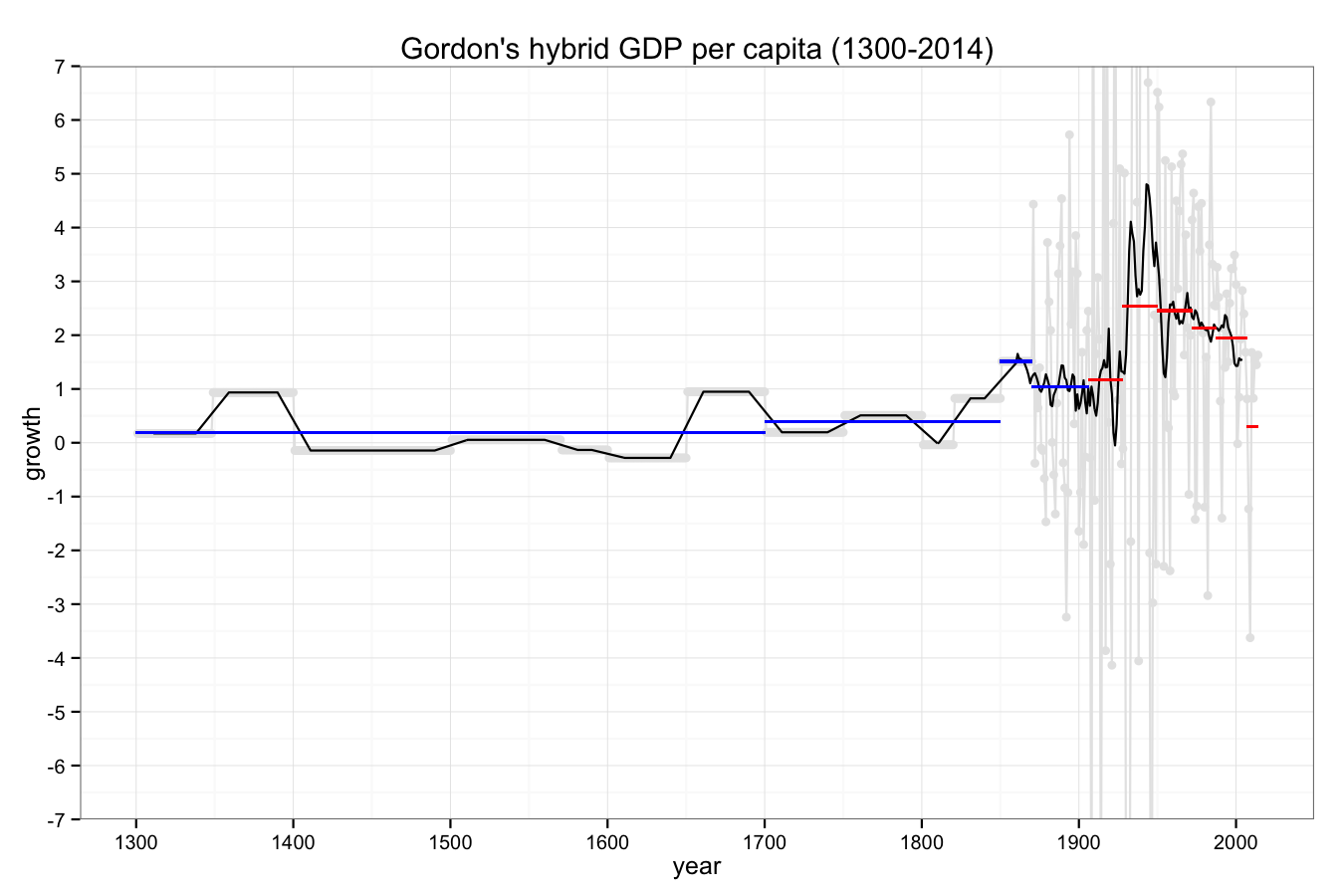
In reality, annual income growth is incredibly volatile, and even the moving average tells a complicated story. By imposing artificial regimes, Gordon hides most of this complexity, implying that the upward and downward growth trends are stronger than it really is.
I’m not suggesting that Gordon has intentionally set out to create a misleading chart - merely that the chart he ends up with says more about his preconceptions (even if historically informed) than the data series itself. Sure, there is some appearance of a a slowdown in the US; but based purely on the data series of GDP growth, it would take a brave pundit to declare that we’re in a fundamentally different growth regime than the pre-1970 period. There are too few observations and there is too much noise.
As with the apocryphal story of Mao’s (or Zhou Enlai’s) thoughts on the French Revolution: it’s too early to tell.
R code for these charts is on github
Add comment
Comments are moderated and will not appear immediately.
Comments (1)