Reflections on four years of using data to explain the world
The events of 2016 were a shock to a lot of people, including me. Brexit and the election of Donald Trump challenged many assumptions that I held about the world. Not least: that public debates would necessarily take place within a basic shared reality.
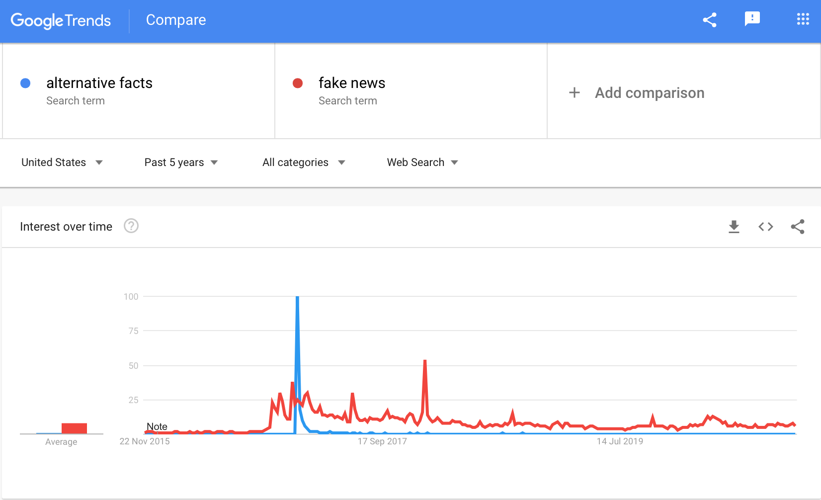 November 2016: when “fake news” entered our common lexicon. The description “alternative facts” had a shorter life but the reality it described lives on.
Those events prompted a shift in career direction for me. In 2015 and early 2016 I worked on internal “big data” projects at the World Bank, but in late 2016 I moved to the central data team, and started to focus especially on the data that we published, and how we visualized and wrote about it. My reasoning was simple: for democracy and rational policymaking to coexist requires an informed public.
There were other reasons, too, for this move, and a good amount of serendipity. But the breakdown of this common factual understanding was central—it bothered me enough to blog about it in June 2016.
I came late to this. Others, like the late Hans Rosling were already working hard in this arena long before I joined it. Explanatory journalism had a moment in 2014-15, and data journalism had been growing for several years before that. In 2015, Our World in Data began its expansion from “Max Roser’s side project” to the quantitative-commentary juggernaut it is today.
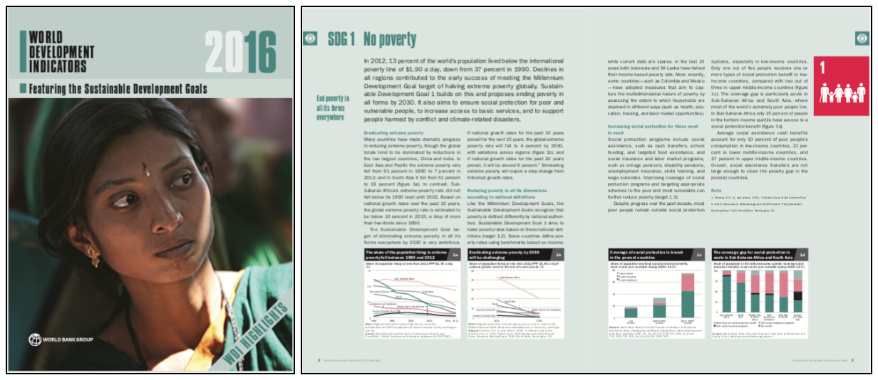
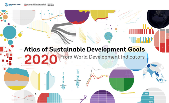
My main contribution to data communication, while at the World Bank, has been the Atlas of Sustainable Development Goals. This started in 2016, just before I joined the data team, as a special supplement to the now-defunct World Development Indicators book.
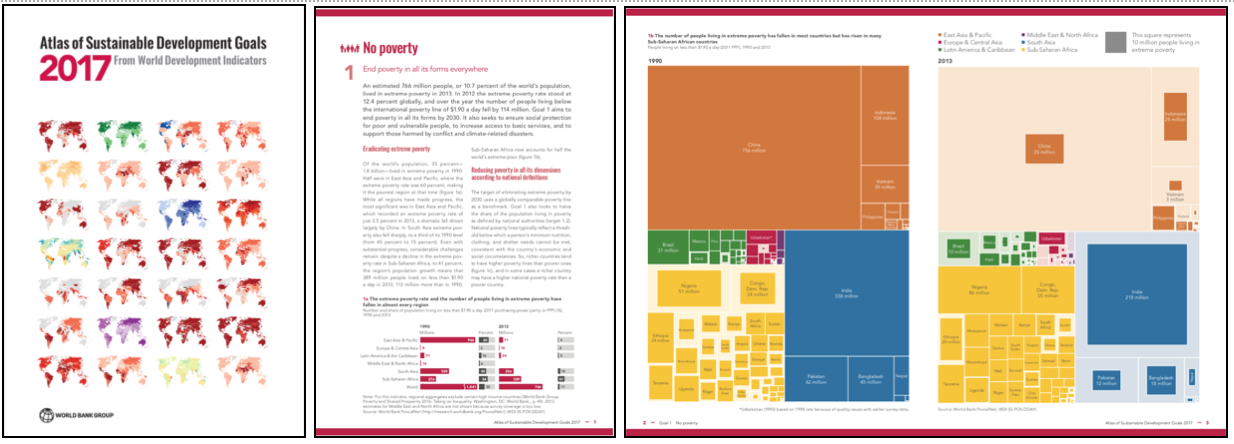
In 2017, we made it a fully-fledged publication in its own right, with more detailed chapters and with much more prominent data visualizations. (I wrote about the chart on the right below here.)
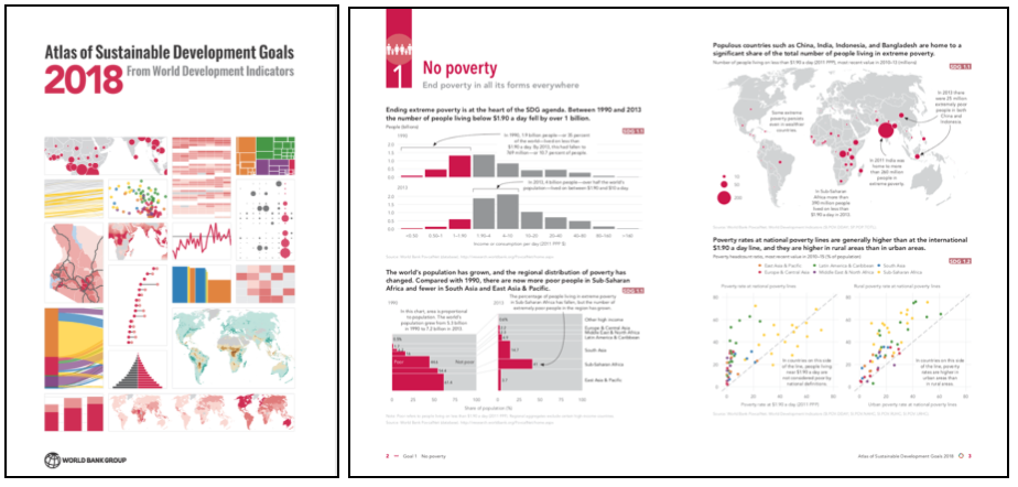
In 2018, Tariq Khokhar and I set out to prove out the hypothesis that R/ggplot2 was powerful enough to produce a beautiful, print ready, entirely replicable publication (we were ~95% successful). This also served as a platform to build the team’s R skills.
After 2018, a shift to a biennial publication schedule neatly coincided with a year of leave from the World Bank, during which I worked on my book.
Since I then left Washington DC and, by last year, formally left the World Bank, I wasn’t planning to be too closely involved with the 2020 Atlas, beyond helping shape the initial vision: a publication that was truly online-first, borrowing storytelling techniques from high-end data journalism.
But COVID-19 intervened and I ended up working on it much more than planned. Editing an institutional publication is very different from writing a single-authored book, more collegial but also more filled with compromises. Overall, though, I’m very proud of what we have done.
The whole contributor list is at the bottom of the home page, but by “we” I especially mean my 2020 editorial colleagues Florina Pirlea and Divyanshi Wadhwa, and the team of talented interactive dataviz developers we worked with / borrowed from the world of data journalism: Maarten Lambrechts, Yaryna Serkez, Jan Willem Tulp and Elbert Wang.
(Quite apart from anything else, working with a team that ultimately spanned two US time zones and four European countries meant that the COVID-19 shift to remote work was hardly noticeable.)
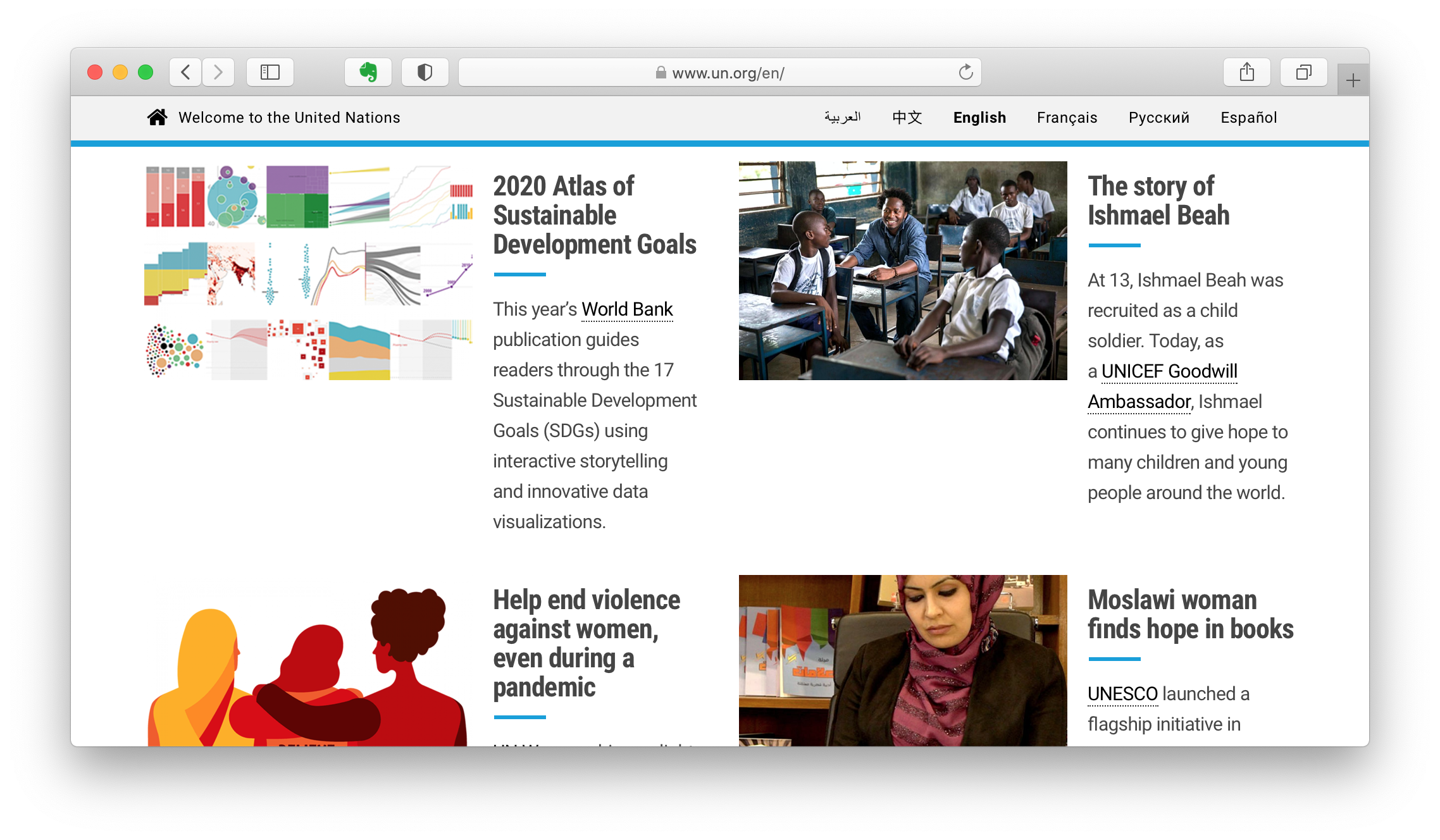
The end result has been well-received, including prominent placement on the UN’s homepage (a rarity for a World Bank publication).
The reason I’m writing this now is not only to celebrate the launch of this publication, but also because this is likely the last time I will work on the Atlas. After several years of doing this, I plan to do a bit less dataviz and data communication from now on, and more of other things.
But I hope other people keep doing it, and more take it up. Although the greatest exponent of the post-fact era may have just been defeated (despite loosing a barrage of alternative election facts), the factors that led to this dangerous moment remain. Explaining the world with data, as objectively and accurately as we can, remains vitally important.
As for me, I’m still working out what comes next.
Add comment
Comments are moderated and will not appear immediately.